
Programming in Design
Lecture 04 – Page Layout with CSS
Edirlei Soares de Lima
<edirlei.lima@universidadeeuropeia.pt>
Page Layout with CSS
•
Page layout strategies:
–
Fixed layouts: are created at a specific pixel width as determined by
the designer.
Page Layout with CSS
•
Page layout strategies:
–
Fluid page design: the page area and columns within the page get
wider or narrower to fill the available space in the browser window.
Page Layout with CSS
•
Page layout strategies:
–
Elastic layouts: expand or contract with the size of the text. If the user
makes the text larger, the box that contains it expands proportionally.
Multicolumn Layouts Using Floats
•
•
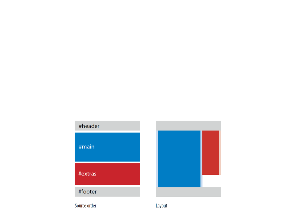
Floats are the primary tool for creating columns on web pages.
–
The advantages that floats have over absolute positioning for layout
are that they prevent content from overlapping other content.
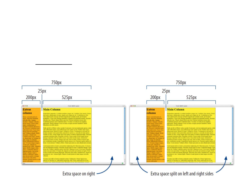
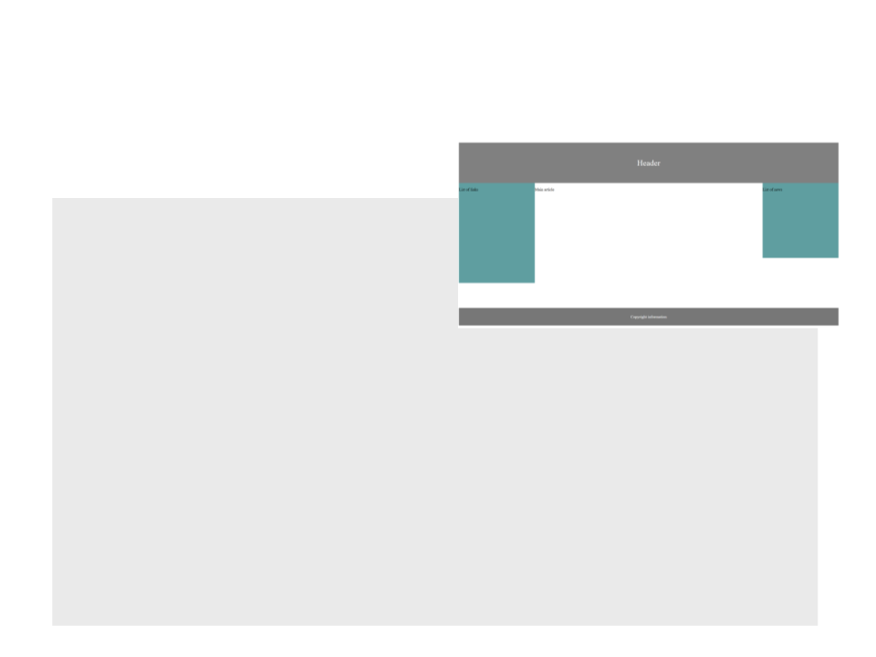
Example 1: two columns fluid layout
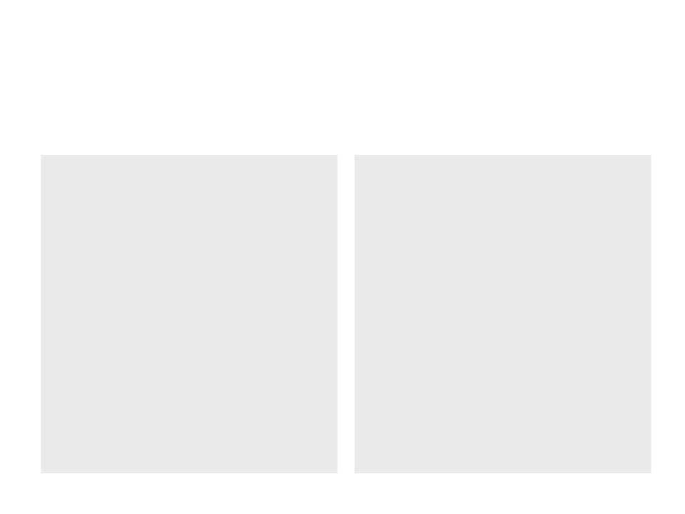
Example 1: Two Columns Fluid Layout
•
CSS:
div.header {
background-color: gray;
padding: 30px;
div.extras {
float: right;
width: 30%;
text-align: center;
font-size: 2em;
color: white;
background-color: cadetblue;
height: 400px;
}
}
div.footer {
div.main {
background-color: #777;
padding: 10px;
text-align: center;
color: white;
clear: left;
float: left;
width: 70%;
background-color: white;
height: 500px;
}
}
Example 1: Two Columns Fluid Layout
•
HTML:
<!DOCTYPE html>
<html lang="en">
<head>
<
<
title>Page Title</title>
link rel="stylesheet" type="text/css" href="mystyle.css">
<
<
/head>
body>
<
<
<
<
div class="header"><p>Header</p></div>
div class="main"><p>Main article</p></div>
div class="extras"><p>List of links</p></div>
div class="footer"><p>Copyright information</p></div>
</body>
</html>
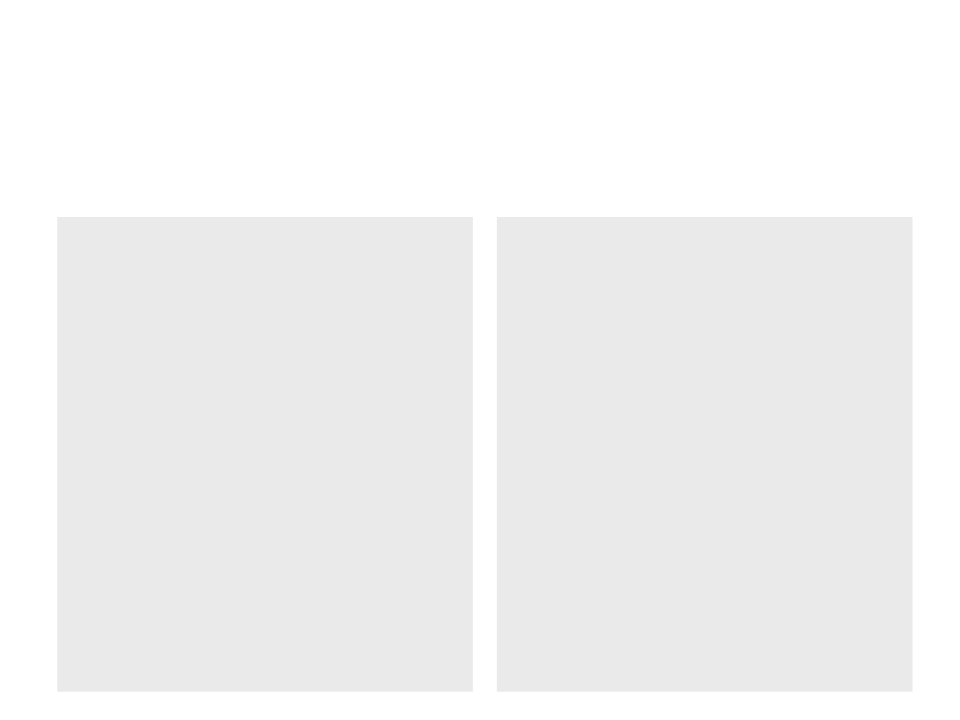
Example 2: Two Columns Fixed Layout
•
CSS:
div.header {
background-color: gray;
padding: 30px;
div.extras {
float: right;
width: 30%;
text-align: center;
font-size: 2em;
color: white;
background-color: cadetblue;
height: 400px;
}
}
div.footer {
background-color: #777;
padding: 10px;
text-align: center;
color: white;
clear: left;
}
div.wrapper {
width: 960px;
margin-left: auto;
margin-right: auto;
}
div.main {
float: left;
width: 70%;
background-color: white;
height: 500px;
}
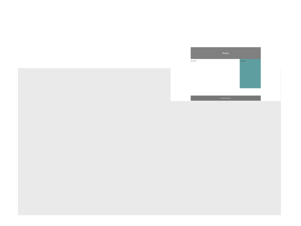
Example 2: Two Columns Fixed Layout
•
HTML:
<!DOCTYPE html>
<html lang="en">
<head>
<
<
title>Page Title</title>
link rel="stylesheet" type="text/css" href="mystyle.css">
<
<
/head>
body>
<div class="wrapper">
<
<
<
<
div class="header"><p>Header</p></div>
div class="main"><p>Main article</p></div>
div class="extras"><p>List of links</p></div>
div class="footer"><p>Copyright information</p></div>
</div>
</body>
</html>
Example 3: Three Columns Fluid Layout
•
CSS:
div.header {
div.links {
background-color: gray;
padding: 30px;
float: left;
width: 20%;
text-align: center;
font-size: 2em;
color: white;
background-color: cadetblue;
height: 400px;
}
}
div.main {
div.footer {
float: left;
width: 60%;
background-color: white;
height: 500px;
}
background-color: #777;
padding: 10px;
text-align: center;
color: white;
clear: left;
div.news {
}
float: left;
width: 20%;
background-color: cadetblue;
height: 300px;
}
Example 3: Three Columns Fluid Layout
•
HTML:
<!DOCTYPE html>
<html lang="en">
<head>
<
<
title>Page Title</title>
link rel="stylesheet" type="text/css" href="mystyle.css">
<
<
/head>
body>
<
<
<
<
<
div class="header"><p>Header</p></div>
div class="links"><p>List of links</p></div>
div class="main"><p>Main article</p></div>
div class="news"><p>List of news</p></div>
div class="footer"><p>Copyright information</p></div>
</body>
</html>
Example 4: One Column with Navigation Bar
•
CSS:
div.header {
background-color: gray;
padding: 30px;
text-align: center;
font-size: 2em;
color: white;
a.navbutton {
float: left;
color: white;
text-align: center;
padding: 14px 16px;
text-decoration: none;
}
}
div.main {
a.navbutton:hover {
background-color: lightgray;
color: black;
float: left;
width: 100%;
background-color: white;
height: 400px;
}
}
div.footer {
background-color: #777;
padding: 10px;
text-align: center;
color: white;
clear: left;
div.navbar {
overflow: auto;
background-color: dimgrey;
}
}
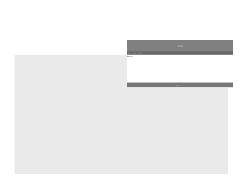
Example 4: One Column with Navigation Bar
•
HTML:
<!DOCTYPE html>
<html lang="en">
<head>
<
<
title>Page Title</title>
link rel="stylesheet" type="text/css" href="mystyle.css">
<
<
/head>
body>
<
<
div class="header"><p>Header</p></div>
div class="navbar">
<a class="navbutton" href="#">Link 1</a>
<a class="navbutton" href="#">Link 2</a>
<a class="navbutton" href="#">Link 3</a>
<
<
<
/div>
div class="main"><p>Main article</p></div>
div class="footer"><p>Copyright information</p></div>
</body>
</html>
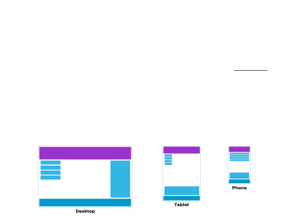
Responsive Web Design
•
What is Responsive Web Design?
–
Responsive web design makes your web page look good on all devices
(desktops, tablets, and phones).
–
–
Responsive web design uses only HTML and CSS.
Web pages should not leave out information to fit smaller devices, but
rather adapt its content to fit any device.
–
It is called responsive web design when you use CSS and HTML to resize,
hide, shrink, enlarge, or move the content to make it look good on any
screen.
Example 5: Responsive Layout
Desktop
Tablet
Phone

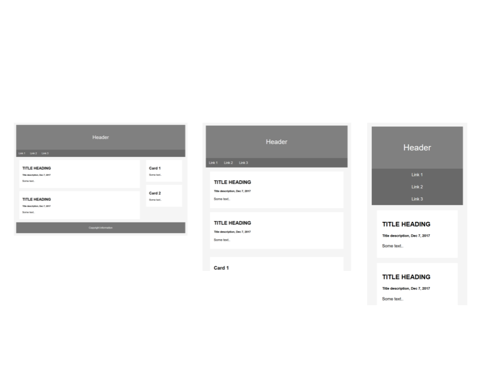
Example 5: Responsive Layout
•
CSS:
body {
font-family: Arial;
padding: 10px;
background: whitesmoke;
a.navbutton {
float: left;
display: block;
color: white;
}
text-align: center;
padding: 14px 16px;
text-decoration: none;
div.header {
background-color: gray;
padding: 30px;
text-align: center;
font-size: 2em;
color: white;
}
}
a.navbutton:hover {
background-color: lightgray;
color: black;
}
div.navbar {
overflow: auto;
background-color: dimgrey;
}
div.row {
clear: both;
}
Example 5: Responsive Layout
•
CSS:
div.leftcolumn {
float: left;
width: 75%;
}
div.footer {
background-color: #777;
padding: 10px;
text-align: center;
color: white;
clear: left;
div.rightcolumn {
float: left;
width: 25%;
}
}
div.card {
background-color: white;
padding: 20px;
margin: 20px;
}

Example 5: Responsive Layout
•
@
CSS:
media screen and (max-width: 800px) {
div.leftcolumn, div.rightcolumn {
width: 100%;
padding: 0;
}
}
@
media screen and (max-width: 500px) {
a.navbutton {
float: none;
width: 100%;
padding-left: 0px;
}
}
Example 5: Responsive Layout
•
<
HTML:
!DOCTYPE html>
<html lang="en">
<head>
<
<
title>Page Title</title>
link rel="stylesheet" type="text/css" href="mystyle.css">
<
<
/head>
body>
<
<
div class="header"><p>Header</p></div>
div class="navbar">
<a class="navbutton" href="#">Link 1</a>
<a class="navbutton" href="#">Link 2</a>
<a class="navbutton" href="#">Link 3</a>
</div>
<div class="row">
<div class="leftcolumn">
<div class="card">
<
<
<
h2>TITLE HEADING</h2>
h5>Title description, Dec 7, 2017</h5>
p>Some text..</p>
</div>
Example 5: Responsive Layout
•
HTML:
<div class="card">
<
<
<
h2>TITLE HEADING</h2>
h5>Title description, Dec 7, 2017</h5>
p>Some text..</p>
</div>
</div>
<div class="rightcolumn">
<div class="card">
<h2>Card 1</h2>
<p>Some text..</p>
</div>
<div class="card">
<h2>Card 2</h2>
<p>Some text..</p>
</div>
</div>
</div>
<div class="footer"><p>Copyright information</p></div>
</body>
</html>

Assignment 2: Website Layout
•
Design and implement the layout of the storytelling website.
–
Use the output of the first assignment as source of inspiration;
–
Story content is optional, but when designing the layout of the
website you must define how the story will be presented and how the
user will navigate/interact with the story;
–
–
If the website comprises more than one page with different layouts, all
pages must be created.
Deliverables: source code and all resources used in the website.
Further Reading
•
Robbins, J. N. (2018). Learning web design: A beginner’s guide to HTML,
CSS, JavaScript, and web graphics (5th ed.), O'Reilly Media. ISBN: 978-
1491960202.
–
Chapter 16: Page Layout with CSS